Mining for Treasure
I am exceptionally bad at keeping a portfolio up to date, or creating a portfolio at all. It’s not fun and it feels kind of… self-promotional… I guess because it is. Photography brings me joy when it brings others joy, so portfolio work doesn’t quite fit the bill. HOWEVER, I recognize that if I’m going to get this photography business off the ground, I need to share the kind of work that I can do. So I begrudgingly put a portfolio together.
As I selected favorite photos, I realized 90% were of my son, Ollie. I was not exactly showing a great diversity of style or subject. So, I went looking through old non-Ollie photos that might be portfolio-worthy. I was mining for treasure.
I found a many diamonds in the rough. Photos that I loved because of the composition, or captured emotion, but weren’t great. But they could be!
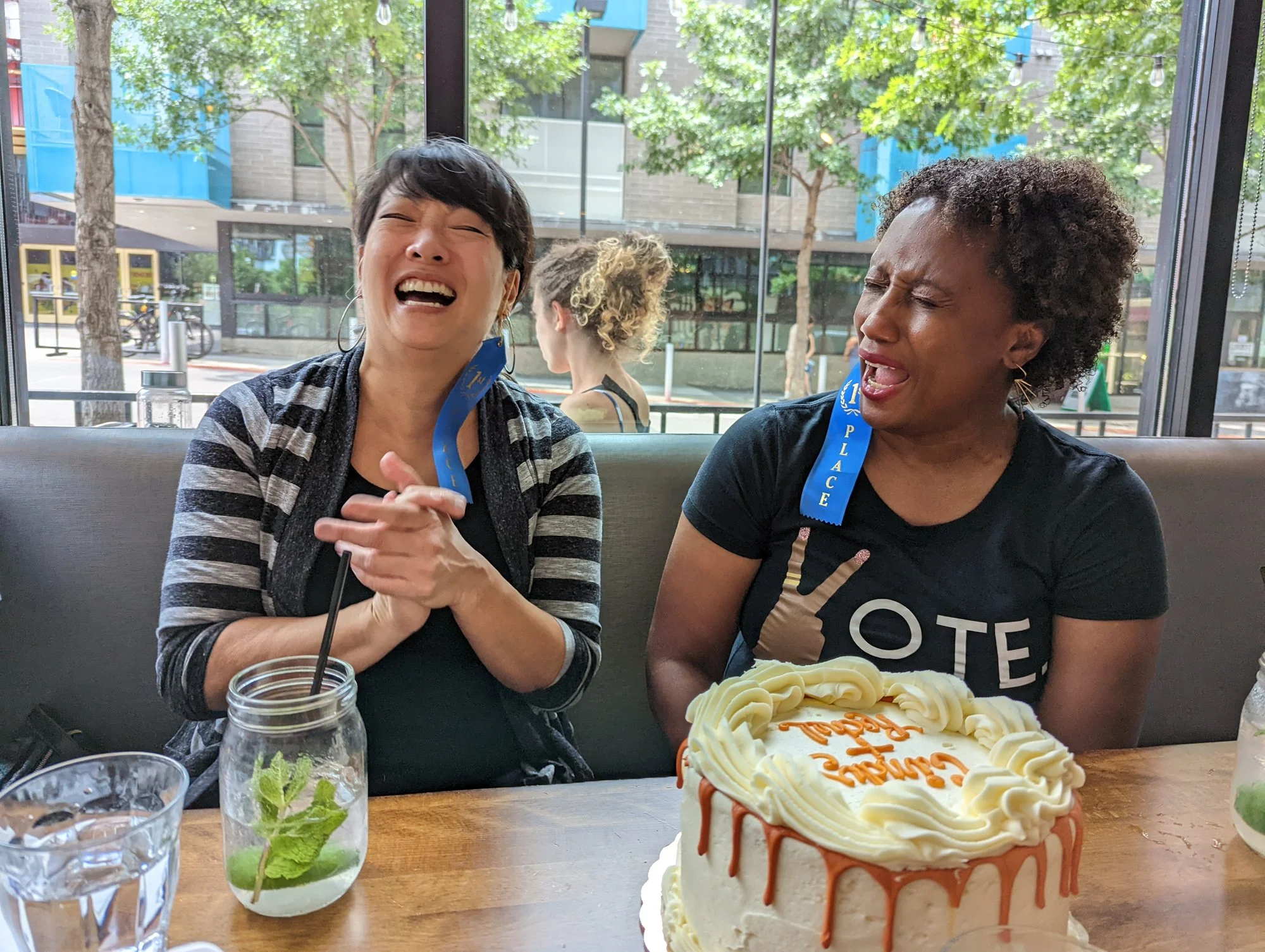
The Birthday Friends
For example, LOVE the emotion captured here with the birthday friends. Rachel and Cindy share similar birthdays are are celebrating together. Love the cake is there for context. Don’t like all the distractions, Cindy’s purse, the person passing by, the general busy-ness of the scene.
BEFORE: Love the emotion, but so many distractions!
I wanted to put the focus on the lovely ladies, their expressions, and keep the sense of place - a birthday party. I removed distractions through a slight crop and removing the person in the background. I removed some of the busy-ness through a black & white conversion. Finally, I made a number of small edits to really let the ladies shine - a slight vignette, grounding backs and pushing the whites & highlights to show of that natural glow.
AFTER: All eyes on the birthday girls!
Those Under-appreciated Mules!
I spent a good bit of the summer with mules for the first time. I have quite a few pictures of them, but somehow, I always ended up with stronger photos of those over-appreciated horses. I wanted to have at least one strong photo of a mule!
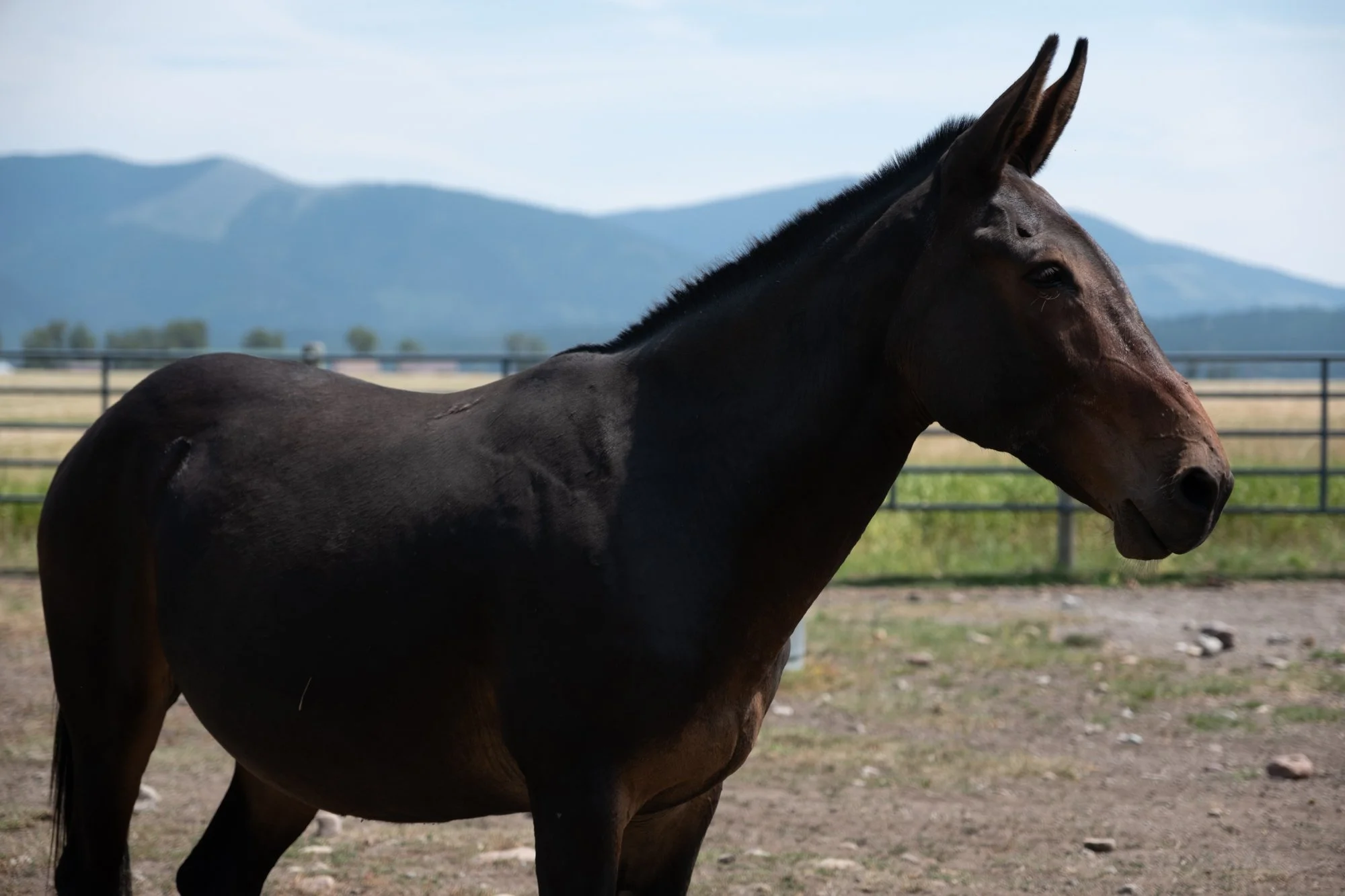
Looking through old photos, I found a mule photo that had had great negative space to work with, but otherwise didn’t have much visual impact.
BEFORE: Weird crop, no visual impact, sad mule
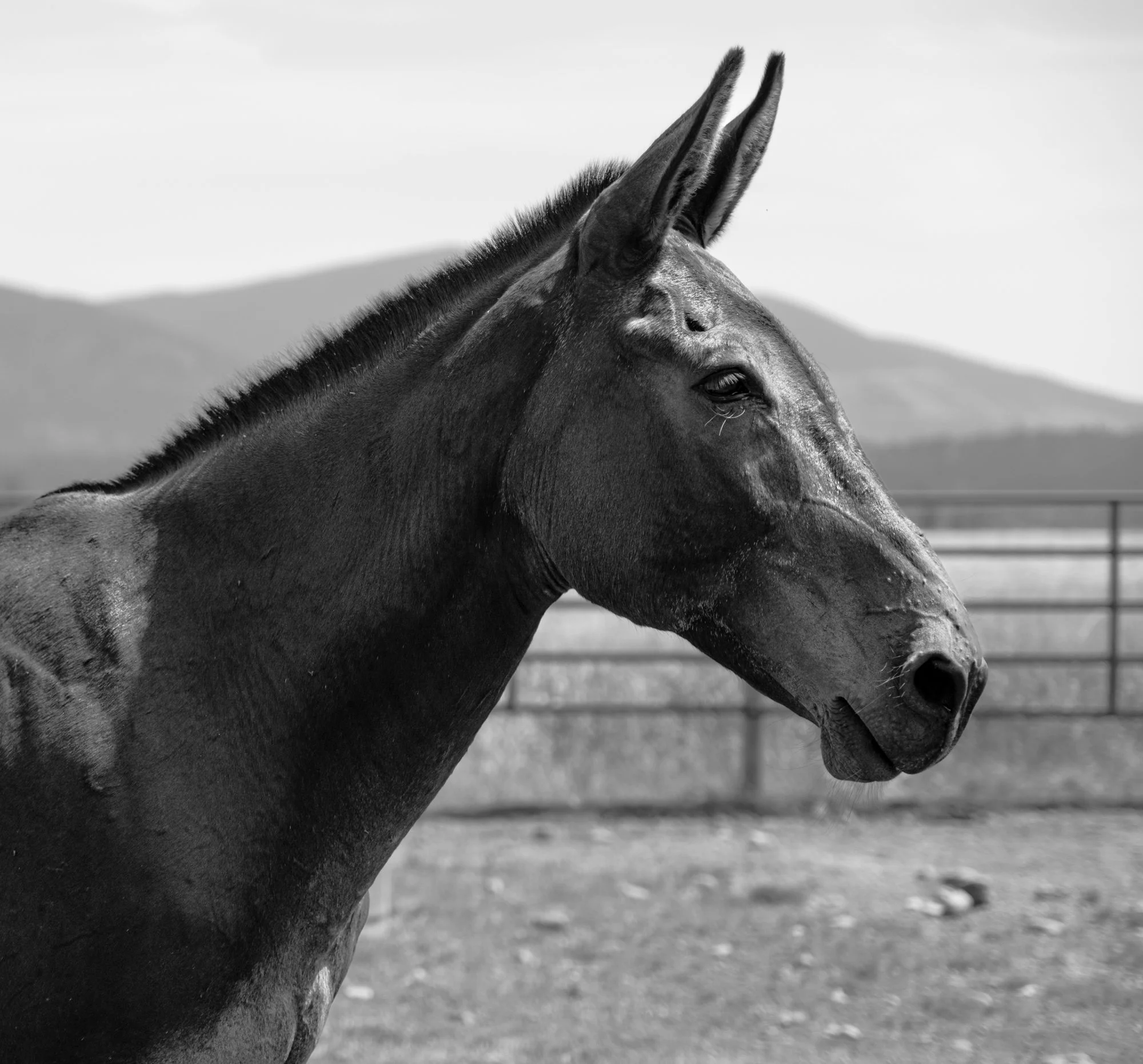
The current photo was a weird crop, so I cropped tighter with a 1x1. I also added a quarter stop exposure and created a custom point curve to capture the detail and texture of the mule. I think there’s a lot of visual impact now, a great sense of place through the mountains in the background, and damn, that under-appreciated mule looks pretty close to stately now!
AFTER: Would you look at that strong, proud, mule!?! And that haircut is SHARP!
Hay, Glorious, Hay!
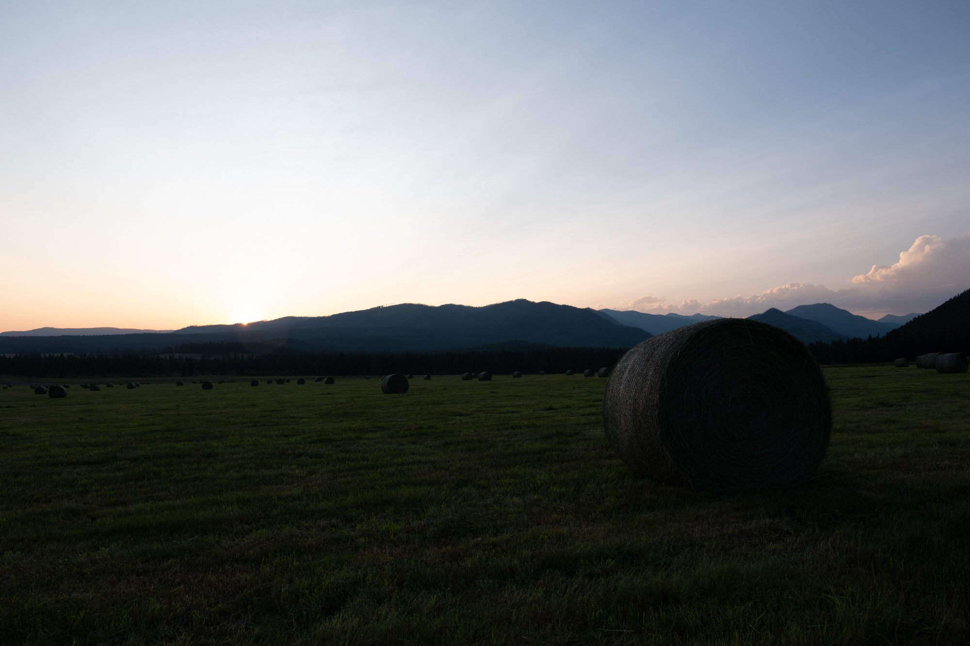
OK, the moral of the story is NOT make it black & white and it will look better. Case in point - The glorious hay field. Is there a hay field more stunning than this one in Ovando, Montana, surrounded by mountains? I think not. But it’s hard to capture the beauty, even at sunset. This photo was disappointing.
BEFORE: I think it’s a hay field?
Can it be saved? Maybe. I bumped the exposure up almost a full stop, cropped out the boring grass in the foreground, blew out the shadows and blacks and tinkered with a number of other things to try to show how pretty that hay field is.
I’m sure there are more hidden treasures, buried away in my photo library… but there are only so many hours in the day!


